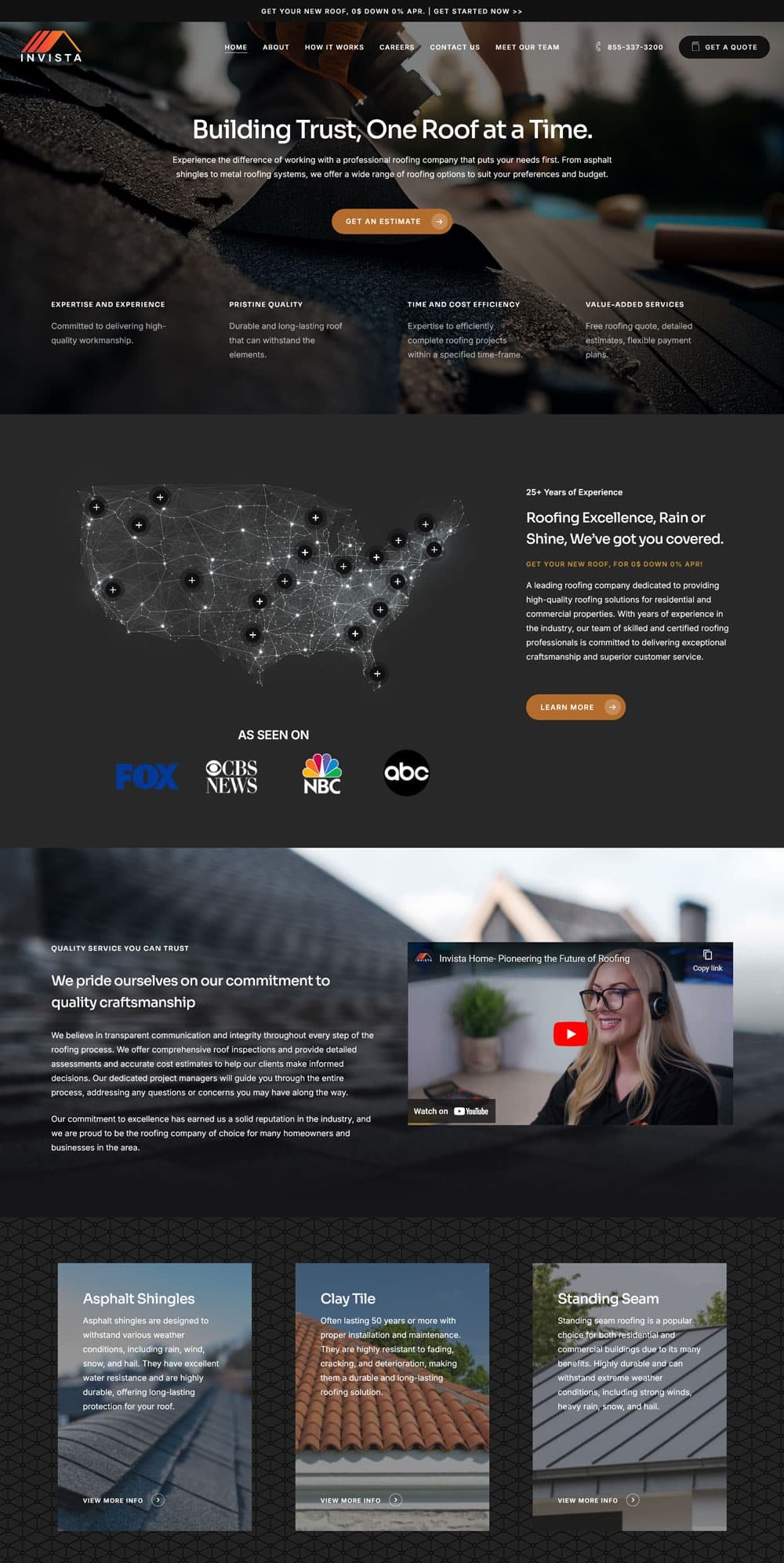
Go Invista
What we did
Industry
Commercial
Description
Designing the Go Invista platform was an exciting challenge that blended creativity, functionality, and user-centric design. At Practical Thinkers, I was deeply involved in creating a seamless user experience that would cater to both seasoned investors and newcomers alike.
The Vision for Go Invista’s Design
Go Invista’s mission is to empower users with tools for better investment decisions. The web design had to reflect this goal by being intuitive, clean, and responsive. We needed to design a platform that could present complex data and analytics in a way that was easy to understand and interact with.
The Outcome
The result is a sleek, user-friendly platform that delivers real value to investors. Go Invista’s web design is not just about aesthetics—it’s a tool that enhances the overall user experience, making investing simpler and more intuitive.

